Hmm, apparently I did something weird this morning and this post vanished into the ether even though I'm sure I published it. Even more annoying, it didn't save most of it, so I've had to rewrite it. Fortunately most of it is based on an old piece of writing from way back in 2001, so it wasn't too much work. I've even managed to put in a couple of pictures - if I'm very patient, I can link to photos that are already on Flickr, I just can't upload any new ones. Using dial-up is like wading through treacle and I can't wait to get back to the 21st century and a fast broadband connection although I am enjoying hearing the old modem sound again, it's quite the nostalgia trip.
Anyway, it's time to raid the vaults... this has been edited slightly to tighten up the language and grammar but is more or less unchanged from the original.
Still Life
1/7/01
I have come to realise that much of what I make is actually Still Life. My photographs, in particular, have a Still Life sensibility. I am looking at small things - like hot raspberries on the beach or the reflection in a bowl of water - and saying that they are small yet important. It seems to me that that is what most Still Lives do: they take everyday things and set them apart so we can truly see them.

Kirsty Hall: Blue Bowl Reflection, circa 1999
Still Life demands that we really look at the flagon of wine and the apple; the bowl of cherries; the lifeless carcasses. It ponders the flowers, the glass and the tablecloth. It shows us the texture of everyday life and forces the realisation that actually these things are amazing: the bread we eat, the soft cheese, the pile of fruit, the luscious cakes, the humble or grand spread. This is what keeps us alive after all. This is what nourishes us. Of course we also need vast epic pictures of the imagination and portraits that force us to look at our frail human bodies. We need art to consider many things but it seems odd that Still Life should so often have been considered the least important subject matter in art, when it deals so intimately with life and death.
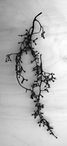
Kirsty Hall: Grape Stem, May 2003
Mortality is a vital component of many Still Lives. Those flowers will soon be dead: they are just caught for a moment in time. Caught at the point of perfection? Or perhaps already weeping their petals onto the rough-hewn table or perfect lace. That food will spoil or be devoured by a hoard of hungry mouths. Even that fine glass goblet will eventually be broken or lost. The table itself will be consumed by history. Who knows what happened to the musical instruments, the sheet music or the pile of books? They are lost to us except for this captured image.
It is that quality of stillness that I love most about Still Lives. More and more my work has been edging towards stillness and quiet, not actual silence but definitely quietness. I think I am looking for contemplation and the mysterious void. Stillness is a quality that I associate strongly with the colour white, which is why I think my work has contained so much white in the last two years. I am searching for that perfect moment perhaps, that moment of clarity and stillness?