Tag Archives: artists

2 Comments

Little People - A Tiny Street Art Project is a blog documenting an art project by artist, Slinkachu. I love the subtitle of the blog, it so elegantly and succinctly sums up the project: "Little handpainted people, left in London to fend for themselves".

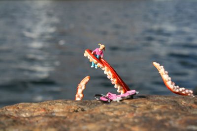
Slinkachu - 20 Inches Under The Sea

I've mentioned my love of miniatures before on this blog and this art hits all my buttons - miniatures - check, slightly disturbing - check, dedicated obsessiveness - check.

I adore the fact that most people will pass these little tableaux by, totally unaware of the tiny dramas taking place beneath their feet. It reminds me of The Borrowers, a series of books that I passionately adored as a child: I was always captivated by the idea that other lives could be going on around us, almost completely hidden from view.

I particularly enjoy the random element of this project - the way the tiny people are obviously painstakingly made but then just abandoned to their fate. It reminds me of the way my brothers used to set up elaborate battle scenes with their plastic soldiers in our garden that would leave my Dad cursing when a forgotten one invariably wound up mangled in the lawnmower!

As someone always prone to anthropomorphising everything, I was usually pretty nice to my dolls (although my Sindy was always slutting it up with the Action Men in a jeep!) but I've heard surprising amounts of rather disturbing stories of doll torture. I'm always amused by people who think that childhood is a time for bunnies, pastels and sweetness and light - I always wonder if they've ever met any actual children! Of course there's an innocence and sweetness to childhood, but there's a darkness there as well and that darkness often seeps out in the way children mistreat their 'little pretend people' with casual or even gleeful cruelty.

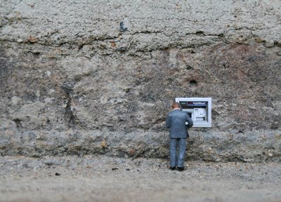
Slinkachu - Cash Machine

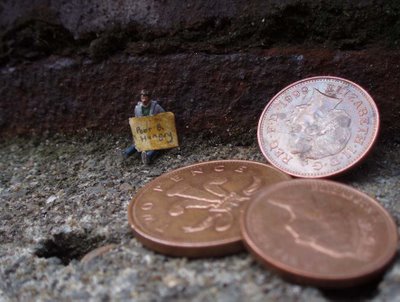
Slinkachu - Spare Some Change

There's clearly plenty of social commentary going on in this art too - this isn't a cheerful world of little teapots and tiny plates of food but an urban world of litter, violence, random encounters with prostitutes, clueless tourists and homelessness. It reminds me of another of my favourite blogs - Overheard In New York is a blog that hilariously documents the more surreal aspects of living in a large city as revealed through randomly overheard conversations.

John Dempcy - Field Day

John Dempcy's luscious acrylic works really speak to me. I love the use of patterning and circles to create endless variations on a theme but most of all, I love his masterful use of colour - the way the colours bleed into each other, the subtle pale colours he uses as backgrounds, the way he uses colour to change the tempo of a piece. I'm not particularly great with colour*, it's not one of my art skills but I can appreciate it in other people's work. Not being a painter, I look at these works and just have no idea how they're done technically but I love them.

Found on Dear Ada, a blog that I like a lot for its great mix of links.

* I say this but I've discovered over the years that I'm only 'not great with colour' compared to other artists, particularly painters. When I talk to non-artists about how they perceive colour, I usually discover that my colour sense is better than average. It's all relative!

We Make Money Not Art is a blog that's always worth a look, they have a lot of stuff about the intersection between art, design and new technology. As a keen knitter, I loved this story about a couple of students, Magdalena Kohler and Hanna Wiesener, who hacked a 70's knitting machine so that it turns your voice into a secret binary design on a sweater.

Just say a message into a microphone and the frequency of your voice is analyzed by a computer and turned into binary code that the machine will interpret to control 24 servo-motors which will turn your words into knitted pattern. And hop! You can wear an individual voice message on a sweater. No one will understand the message, it will stay in your head. The pattern doesn't just depend on the words but it varies also according to your modulation, whether you are excited or totally introverted.

Isn't that neat!

I've been involved with The Here Shop and Gallery in Bristol for several years now. Until the spring of this year, I was on the gallery committee and did a fair bit of curating over there but I'm taking a break from it at the moment to concentrate on my own work. It's a fantastic place - the shop part is full of funky crafts, art, magazines, independent music and small press books, while the gallery shows monthly exhibitions of cutting-edge, emerging artists. And despite being entirely run by volunteers, it's survived for nearly 4 years without any significant public funding (we've had the odd little drop but mostly the shop funds the gallery). It's unique in Bristol and deserves a much higher profile than it currently has.

This month the gallery is showing Mark Pawson. I went to the private view last night and had a fun time hanging out with folk I hadn't seen much lately, including Alys, Camilla and Peskimo.

The show is good with lots of different stuff to see but all of it with a clear and identifiable 'Mark Pawson' look. I like his 'low tech' ethos, particularly in relation to printing and the emphasis on the handmade.

I loved these little sugar packets all sewn together like a patchwork pattern.

If you're in or near Bristol, you should definitely try to get along to see this one but if you're a bit further afield, you can experience the exhibition virtually on the gallery Flickr page.

If you're interested in showing at the Here Gallery, take a look at the previous exhibitions page and the submission guidelines.

8 Comments

Well, the wedding was delightful and we had a lovely weekend but I'm very glad to be home and picking up the reins of my life again: the wedding has dominated the last couple of weeks and I'm keen to get back to my own work. I did hand out lots of little Moo cards though, so many in fact, that I'll need to do another order soon. I'd been planning on buying a box this month anyway because I wanted some to promote this site. Just another small reminder that promotion needs constant effort.

I was looking for images of insect wings in Google Images earlier, when I spotted this article about Tasmanian artist, Catherine Woo.

Catherine Woo
Catherine Woo with Unknown Work. Photo: Simon Schluter

I enjoyed her very organic work, which uses materials such as mica, mica dust, powdered marble, lead and burnt paper to create images that reference scientific imagery and the natural world. There are some images at her gallery, but I wish she had her own website so that I could see more of her work.

Catherine Woo
Catherine Woo - Tela fortis 2002

I prefer her older, more microscopic and patterned work to the more recent cloud imagery in the gallery website, which seems a bit too literal to me.

10 Comments

Danish artist, Peter Callesen makes amazing sculptures from cut paper.

Peter Callesen - papercut sculpture
Peter Callesen: Impenetrable Castle (detail), 2005

I love the simple whiteness and complex, intricacy of his work. Of course, the more complicated papercut sculptures will tend to impress most viewers because of the high level of skill and craft needed to make them - I'm sure they're his 'crowd pleasers'. However, in many ways, I'm more impressed by the very simple ones because I think it takes more courage as an artist to exhibit very minimal work. The less you have, the more focus there is on it and the more exact it needs to be.

Peter Callesen - papercut sculpture
Peter Callesen: Snowballs (detail), 2005

I'm also rather charmed by the contrast between his incredibly precise papercut work and his loose, exuberant drawings.

Peter Callesen - dying swan drawing
Peter Callesen: Drawing from The Dying Swan series

In fact, if you look at the different sections of his site, it's apparent that he takes very different approaches depending on the medium. However, because he's working with a central theme of fairytales, it all seems to come together. It's clear looking at the rest of his practice, particularly his performance work, that ideas of absurdity, futility and even tragedy also play a large part in his thinking.

6 Comments

Unsurprisingly, given the prevalence of small objects in my own work, the idea of the miniature has always fascinated me. It's easy to fall into kitsch with it though, something that Thomas Doyle manages to avoid. Instead, his tiny worlds capture and reveal intense moments of strangeness in which we're the ultimate voyeur.

Sometimes it's pretty clear what's going on, as in this piece:

Thomas Doyle = The Reprisal
Thomas Doyle: The reprisal, 2006

But in others, the narrative is far less obvious, leading to an art that speaks of fracture and dislocation.

Thomas Doyle - They draw you out
Thomas Doyle: They draw you out, 2006

His work makes me think about that moment in a dream when the unnerving quality of an almost normal situation suddenly overwhelms you and you start to slip inexorably into a nightmare.