Last week, I was lucky enough to be a recipient of a beautiful hand-bound book by Kaija as part of the Paying It Forward exchange. I've been putting off blogging about it because a) I haven't been able to get a decent photo of the book and b) I wasn't sure if any of Kaija's other recipient's read my blog and I didn't want to spoil anyone else's surprise.
However, since Kaija has just blogged about it, I guess it's OK to go public about it now.
My book was beautifully wrapped...
And unsurprisingly, there was much squealing when I undid the ribbon to discover this...
Kaija took much better pictures than me, you can see the stitching and the image properly on her photograph.
Handbound book by Kaija, photograph by Kaija
Isn't that stunning! The book opens completely flat, which is very helpful in an art journal and I love the image of the bare tree and the way the stitching goes into the cover. What you can't see in the photos is that the pages inside are also brown paper - Kaija somehow miraculously knew without being told that I adore notebooks with brown pages. I may be visiting Australia in the spring for my brother's wedding, so I have decided to save this very special book to use as a travel diary.
I can't even begin to describe how fantastically well-made this book is and how wonderful it feels and looks in real life. It's way beyond my own very limited book-binding skills and I'm quite in awe of her talents. I can only suggest that you all head over to her Etsy shop and indulge in one of her very reasonably priced treasures.
Now I just need to get my own exchange items out to my three Paying It Forward recipients; Kim, Liz and Tina. I have started work on my items but it'll probably be at least another couple of weeks before I get them in the post; I'm never quick about these sort of things.
I have always been fascinated by artists' studios, to the extent that I even wrote my BA dissertation on them. One of the things I find so compelling about them is their very distinct aura: well-loved and much-used studios have a powerful sense of place. I'm sure it's one reason why art trails and open studio events are so popular; being allowed into the spaces where other people create has a seductive allure and the strong suggestion of intimate secrets revealed. Personally, I can never resist having a peek at other artists' storage systems. Is there an order that I can discern and do I understand it? Would I have arranged things differently and what does their system tell me about them? How have they organised their tools - are they a neat or a messy worker? And do they clean their brushes!
You can often get a strong sense of the artist's personality from their studio. When I visited Barbara Hepworth's studio in St Ives, I was struck by how very present she was: even though she was dead, it truly felt as though she'd just popped out to do a bit of drawing on the beach and she'd be back to finish off that stone carving any second now.
Artists are usually well aware that their studio is almost a person in its own right - at the very least, it has a definite genius loci or 'spirit of place'. But in order to keep this spirit happy, a studio needs to be inhabited, it needs to be worked in. I've often heard artists describe their studios as 'dead' or 'stale' when they haven't been working in them enough and I'm sure most artists are familiar with the need to tidy the studio after an absence or when they're getting ready for a new series of work.
I've been having that discontented 'I need to start something new' art itch lately and have even been questioning the direction that my work has taken in past years - in short, I feel on the cusp of change. So it's no coincidence that my studio has been undergoing a redesign in the last couple of months. In the summer I acquired some much-needed shelving and moved the desk to a better position and it instantly became a much more inviting creative space.
A studio is a working space and consequently it needs to work - things have to be accessible and easy to find, you need to know where your materials are and to have power, heat and light where you want them. Your studio also needs to be right for you and your working pattern, which is why artists' studios are so very individual and revealing. While I'm absolutely enthralled by Francis Bacon's re-created studio, I know I couldn't create a single thing in it - I need more order and much more visual simplicity than that. Your studio should fit you like a pair of comfortable shoes - if it doesn't, then you simply won't want to spend time there. I hadn't consciously realised how draining and unappealing I'd been finding my own studio until I started the overhaul.
It's also important not to get hung up on romantic images of what you think an artists' studio should look like or where it should be - spend some time exploring what your studio needs to look and feel like. When I first graduated, I paid for three months of studio time in a cold, noisy building on the other side of town because I thought that 'a real artist needs a proper studio' and I thought that meant a building with other artists in it. Then a conversation with a friend made me realise that I did all my best work at home and always had done - when I was in college, I used to work in the evenings on the dining room table and then take my work into college and install it in my space. My days at college weren't usually spent making - instead they were spent researching in the library, updating my sketchbook, pottering around seeing what everyone else was up to, drinking endless cups of tea and gossiping!
Recognising this fact made it apparent why dragging myself over to the cold, expensive studio had been so very hard - there were no friends, no communal cups of tea and no nice library books!
We're fortunate enough to have a large house, so I promptly cancelled the studio, happily put the rent money towards materials and got on with working from home. For a while I worked downstairs in our basement before discovering that it was wrong for the kind of work I make - everything got damp or dirty and I didn't like going down there because it was too dark and gloomy. Eventually I moved up to a spare room in the top floor of the house where I have cream walls, lots of natural light, plenty of warmth and carpeting - apparently I am an artist who needs a lot of home comforts in order to create! Yet even when I was finally installed in the right space, it took me until this year to get my studio working properly and it's still not quite how I want it.
So this afternoon - bone tired after a bad night of insomnia and with all my creative wells dry - I once again found myself tending to The Spirit Of My Studio. My son helped me carry up boxes of materials from the appropriately named Cupboard Of Doom. I then spent an hour sorting through them, getting rid of some things, rehoming misplaced items and then labelling the boxes with my beloved Dymo labeller before stacking them neatly on the shelves.
It's still not quite right in there but each time I organise my studio, it gets a little bit clearer. And I feel that space inside, the space where the new work is beginning to grow, getting just that little bit bigger and I breathe a little more easily.
I think I just fell a little bit in love. Suzi Blu is a cute young art goddess who makes short videos about art journalling that she puts up on YouTube.
I just love her quirkiness and her passion. She's done lots of videos - there's a list here - and I'm having a happy evening working my way through them.
OK, I have a BIG confession to make. All through college, I kept immaculate, beautifully presented and very professional A4 sketchbooks. Looking up at the shelves above me, I see fifteen of them in an ordered line, their spines labelled with the dates. They're almost identical - always portrait style and usually black, with a couple of patterned ones when I couldn't find black ones.
Not for me the messy, spilling out at the seams, arty sketchbook barely held together with bits of string or rubber bands. Although I adore that style when I look at other people's journals, at the time I just couldn't bring myself to be that messy. Instead, my sketchbooks closed tidily on pages filled with perfectly aligned, neatly trimmed images and printed or carefully handwritten thoughts on my art. It's slightly odd because I'm certainly not a naturally tidy person - maybe I was searching for a safe space within the chaos?
I spent a lot of time on those sketchbooks. I kept huge boxes of trimmed photos that I regularly culled from magazines and I would spend happy hours sorting through them looking for just the right combination of images that would show where my inspiration was coming from. I patiently selected the photos that showed my work to its best advantage, as well as the 'during' shots that documented the process and lined them up and taped them in. I added documentation from exhibitions I was involved in and analysed what I could have done better. I went through hundreds of rolls of my beloved double-sided sticky tape. I thought of my sketchbooks as works of art in their own right and they truly are. When I reread them, I can see that they are wonderful objects, as well as being useful documents that accurately chart my artistic process through the years. I'm justifiably proud of them and I love to look up at that neat line of them on my bookshelf.
But... but... but...
I got out of college and my sketchbooks sort of ground to a halt and then stopped almost completely. Every so often I'll pick up the current one, write an 'it's been far too long since I've written anything in here' entry, post in a couple of pictures, write down a few ideas and then guiltily ignore it for another six months. I think I've filled nearly two in the last five years - me, an artist who once went through a sketchbook every three months or so! It's pitiful and it's been weighing on me a lot recently.
I'm sure it's no coincidence that my sketchbook use tailed off when I started blogging - a lot of my writing energy undoubtedly went into my online journalling instead. In addition, no longer being in college seemed to take a lot of the 'people judging me' energy out of it. There just wasn't the same drive to do my sketchbooks that there had once been.
Don't get me wrong, I've never stopped writing down my ideas - I have a little notebook by my bed where most of my art pieces start and another notebook in my handbag to catch the ideas that happen when I'm out of the house and I treasure both of those. I also write ideas on my computer if that's where I happen to be, keep a card index box of 'art ideas' on my desk and for the last two years I've been doing a series of ink drawings in an ever increasing pile of A5 cartridge pads.
But those well documented, bright, shiny and oh-so-acceptable sketchbooks - er, not so much! I'm kind of embarrassed about it and I feel guilty and cross with myself. But when I think about sitting down and taping in photos, writing about what I've been doing, trimming photocopies and images to fit the pages and lining everything up perfectly - well, my heart just sinks. It feels overwhelming and impossible and it's time to admit it; something that once brought me genuine joy and satisfaction, now just fills me with dread.
After watching Suzi's videos, I thought 'enough already, I've got to do something about this situation'. So I picked up the mostly unused moleskine sketchbook sitting next to my computer and let rip with some black goache, white ink pen and a couple of my beloved Inktense pencils. Wham, two pages of art journalling done in about half an hour and boy, do I feel better. No, it's definitely not my perfect and pristine sketchbook but it's obvious that the old way isn't working any more, so I need to try something new.
Our 'shoulds' can really inhibit our art; they stifle the flow of creativity within us. Yes, it would be nice if I could keep making those beautiful ordered sketchbooks and I probably 'should' but it's far more important that I keep my art going. On the first page of my new journal I wrote in coloured pencil "It's time to get messy" and it is. Perhaps one day those pristine sketchbooks will be right for me again but for now, it's time to let them go.
Last night I pottered over to my friend Camilla's private view at the Here Gallery. Unfortunately I got there quite late, which meant that I missed seeing some friends but there was a silver lining because I got to go to the pub with Camilla and a few people afterwards.
The show is called Abracadabra and features work by three different artists - Cindy Jaswal, Claire Platt and of course, Camilla Stacey. It's a fun little show and well worth a look if you're in the Bristol area. Interestingly, the show came about after the artists met through the internet - yet another example of how artists can find and develop art opportunities online.
Camilla is showing some of her series of reglazed found porcelain figures against a background of hand made wallpaper. She hunts for little figures in charity shops and then re-paints them with gold lustre glaze and then re-fires them. The glaze seems to make the figures heavy and sometimes slightly melancholic because it's not a bright gold but more of a dull, thick colour that seems to pull the light into the figures rather than reflecting it. She also had a set of white figures in varying states of decrepitude that she'd cast in plaster. She gave me a little head with a missing nose, which I'll be putting in my cabinet of curiosities. I hadn't seen this work before, so I was interested in how it was coming along but I was sad that Camilla hadn't shown any of her excellent drawings.
Camilla Stacey - Virgin Mary
Claire Platt trained in Bristol but now lives and works in London. She's showing a large group of her embroideries, drawings and ceramics based on human anatomy. I liked these a great deal, they're shown in a big group and I love the way they work together. A lot of the pieces have gold thread, are encrusted with sequins or are shown in mirrored or gilt frames - it could be tacky but somehow it really works.
Claire Platt - Installation View
I was a bit naughty and bought myself an early birthday present - one of the most abstract drawings (you can't see it clearly but it's the little blue rectangle on the bottom left). Claire, if you happen to read this, I'm thrilled to have got one of your pieces but both Camilla and I think you're drastically underpricing your work!
If I'd had the money, I would definitely have bought one of Cindy Jarwal's exquisite ink drawings too. Sadly, although they were very fairly priced at £100, they were just a bit out of my reach - one of the downsides of being an artist is that although you'd happily buy art, you don't usually have much of a budget for it. I'm not showing Cindy's work in this post because she asks that people don't reproduce it without permission but you can see more of it on her Flickr or her website and it's gorgeous so I strongly encourage you to hop over and have a look. Her style reminded me quite strongly of my own Diary Project drawings, so it's not surprisingly that I liked them so much. They were my favourite things in the exhibition and I may just have to go back and see if I can buy a piece in instalments. I don't buy that much art - usually just one or two pieces a year - but I know that I'll absolutely kick myself if I don't get one of these.
Luke Chueh's paintings astound me. Glancing at the thumbnails, I thought they might be overly sweet and sentimental - ha, nothing could be further from the truth!
Luke Chueh - 15 Minutes of Fame
Obviously many of his paintings - with their cast of sad bunnies, worried chickens, disturbed monkeys and world-weary teddy bears - explore horror and the darker side of childhood. However, what takes his work up to the next level for me is the expressions on his characters faces; there's such pathos there but described with such precise and retrained economy. There's always been something a little tragic about cuddly toys and he exploits this to the full, but his twisted, and often very silly, sense of humour usually stops his work from becoming maudlin. On a technical level, I love his pared-down palette of sombre colours.
Luke Chueh - Monkey Grinder
His work is sometimes available as prints from Munky King and he's definitely on my list of 'artists whose work I want to own'.
Having seen the Paying It Forward idea on Artist, Emerging, I immediately wanted to join in, so I headed over to the people Deanna was making things for and was delighted to discover that Kaija from Paperiaarre still had one space. So I'm her third person and I consider myself very lucky because wow, just look at the gorgeous books she makes!
I've done a little bit of very simple book binding and it's a lot of fun but I've certainly not made any as luscious as this. She also makes very beautiful handmade brooches.
I will send a handmade gift to the first 3 people who leave a comment on my blog requesting to join this PIF exchange. I don’t know what that gift will be yet and you may not receive it tomorrow or next week, but you will receive it within 365 days, that is my promise! The only thing you have to do in return is pay it forward by making the same promise on your blog.
Pretty straightforward huh, I agree to make and send something to the first three people to comment, who then make things for their first three commenters and so on. OK, have at it, people...
EDIT: Even though it looks like I've got three responders, one of them is my partner and he doesn't actually want to take part - he was just responding to the question of who came up with the term 'paying it forward' - so, there's still one spot available.
* I've tried to find out who originally started this idea but haven't been able to follow the thread of connections back far enough. Does anyone know who should get the credit?
Wow, I didn't mean to be away for so long - sorry about that. Despite my policy of trying to post most days, the last two weeks have been completely hopeless. Last week I had the cold from hell, on top of an existing illness and it just knocked me flat. I'm still sneezing explosively but at least I've got my voice back and I'm thankful that I'm no longer violently coughing quite so frequently. Ah well, at least it's taught me is that I need to store a backlog of extra posts to use when I'm not well - so I guess it was useful for something!
Needless to say, not much art has been happening around here lately - I've been managing to do my daily envelope for The Diary Project and that's been about it. However, in between doses of cough medicine and Lemsip, I have been getting plenty of knitting and reading done - so here, for your delectation and delight, is a book review.
Following Katherine's positive review of The Drawing Book by Dr. Sarah Simblet, I ordered a copy from the local library (don't you just love interlibrary loans!) and it's been my late night reading for the past week or so.
I can safely say that The Drawing Book will definitely be going on my Christmas wish list because it's absolutely chock full of good stuff, including one of the clearest explanations of traditional perspective that I've read.
The book is split into short, well written chapters on a variety of subjects including landscape drawing portraiture, nature drawing and even abstract drawing. I particularly liked that drawing from the imagination wasn't ignored - so many drawing instruction books focus solely on realism, which often puts me off since that's not my primary interest. Simblet introduces each topic with relevant drawings, both her own and other artists, before going on to detail a drawing exercise that the reader can attempt. However, even if you don't try any of the exercises - and I haven't yet - you'll still get a lot out of this book.
I was particularly struck by the way she looks at drawing with a fresh eye and how she's able to communicate that to the reader. The book is full of a wide range of great drawings and she has included some more unusual artists alongside the usual subjects such as Picasso, Goya and Rembrandt. The range of drawings is pleasingly global and stretches from neolithic cave painting right through to contemporary artists who are taking drawing in new directions. It was actually a little odd that I'd met three of the people whose work she showed but since she used to teach at my college and they also had links there, I guess it's not so very strange - the British art scene is staggeringly small at times!
The information about materials is also very solid. Apart from focusing on the usual things like paper, pencils, ink and charcoal - which all have handy, nicely illustrated, double page spreads scattered throughout the book - Simblet also highlights some more unusual drawing materials like silverpoint, which I've never considered using before and am now very keen to try. Her explanations of drawing materials are straightforward and easy to understand without being overly simplistic. Indeed, the same can be said for all the language throughout the book, which makes it pleasingly accessible - frankly, this is an absolute blessing since far too many art books are heavy-going to say the least.
I'd say this book would be good both for relative beginners and more experienced artists who are looking to expand or develop their drawing skills. Older children who are keen on art might also benefit from this book, not least because of the potted tour of art history. That said, I don't think it's a book that I'd give to a complete beginner because I think they might find it a bit daunting. But if you've been drawing for a little while and have got past the absolute basics, then I'd definitely recommend it - I've been drawing for years and I still learnt loads. Plus, it's beautifully laid out with high production values, reasonably priced, well edited and best of all, it doesn't make drawing seem boring!
Joanne B Kaar is a Scottish artist who works with fibre and bookmaking. In 2006 she completed a three month residency in Durness in Sutherland, which she documented in a fascinating blog.
Joanne B Kaar - Sango Sands Seapapers
During the residency she made a series of books from handmade paper, often using local materials. Some of these books were subjected to pretty harsh treatment like being buried or thrown in the sea! It's amazing that they've survived as well as they have - it's easy to forget how robust paper can be as a medium.
Sutherland is a place that is very dear to my heart. Most of my childhood holidays were spent in Achnahaird in Ross and Cromarty and every holiday included a day trip to Lochinver in the neighbouring Sutherland. Although it was very close as the crow flies, it was an hour-long drive on a narrow, twisting and often terrifying road. I've just checked and according to the AA it's 16 miles yet takes an hour and 8 minutes - that should give you an idea of just how bad the road is! It was worth it though - not least for the annual visit to Achins Bookshop in Inverkirkaig - apparently the most remote bookshop in the British Isles. I always saved most of my holiday money so that I could splurge on books and I still remember the feeling of deep contentment that walking out with a bag of carefully chosen books gave me. I also have fond memories of standing on the pier in Lochinver watching the fishing boats unloading and sitting on the seafront eating homemade pies from the incredibly good local bakery.
Durness is a lot further up the coast and not somewhere I've visited but Joanne's photographs of the area, with all their Highland familiarity, certainly brought up plenty of nostalgia. I love living in Bristol and feel very at home here, but so many of my creative roots lie in those summer holidays in the Highlands - long days spent damming little streams with my brothers and cousins, building complex sand sculptures with my Dad, riding invisible horses, grinding down sandstone in an attempt to make pigment (I used to pretend I was a neolithic cave painter!), patiently drawing for hours in the caravan on rainy days and writing bad poetry once I was a teenager. For several years now I've been needing to reconnect with those roots and I know that I absolutely must make a trip to the Highlands soon because the feeling is getting quite desperate. While I don't really subscribe to the idea of a 'muse', I have learnt over the years that it's not a good idea to ignore particularly persistent creative cravings.
Where do your creative roots lie? Is it a place? A feeling? A particular smell? A certain kind of pencil or the feel of a fresh sketchbook?
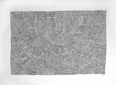
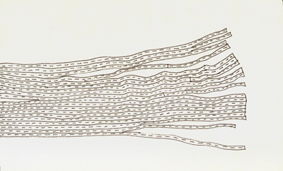
Unfortunately, I haven't been able to find out all that much about Dutch artist, Anita Groener but I like the way her work alternates between spareness and complexity.
Anita Groener: Labyrinth IX
Anita Groener - Freeway
These two works form part of the Crossing series. Over the space of three years Groener drove about 12,000 kilometers between The Netherlands (her homeland) and Ireland (her adopted country) and these regular road trips became a huge influence on her studio practice. She describes this series in the following way:
The verb Crossing signifies movement, a movement which is not uniform but which is drawn back and forth. In my drawings I try to capture the delineation of movements of thought processes occurring in space and time, between here and there, between the point of departure and arrival. The journey of the line marks the surface turning it into visual patterns. What you see is a physical manifestation of the layers of routes and directions taken in this process, revealing its manifold meanings.
I've found so many stories and links that I'd slung into the folders on my desktop, that the only way to get through them is to do a bit of a round-up. Maybe I'll make this a weekly feature since I always seem to find far more than will comfortably fit into my regular blogging schedule.
Bob collects pencils - lots and lots of brand name pencils. Now, I like pencils as much as the next artist but this strikes even me as a tad odd. It is a well done site though - I like the regularity of the design and you know what, Bob's right, these pencils are kind of beautiful when you see them all en masse.
Such a clever idea - people who've matched their screensavers to the background behind their computer so that it looks as though their computer screen is transparent.
Craig Robinson has done a series of what he calls 'lollipops' - abstracted computer drawings of musicians and pop stars. I was fascinated by how little I needed to identify some of them. I listen to a lot of music on my computer but I don't watch MTV particularly, so I was surprised at how often the names of musicians instantly popped into my head - even ones I'd never heard sing. Even when I couldn't remember the name, I'd often still know who it was meant to be - I guess most of us are steeped in celebrity culture whether we want to be or not.
It's not art related but this YouTube video of a small child trying to communicate something important to his increasingly giggly father makes me laugh hysterically every time I see it.
All my post its were drawn while doing something else in an ad agency: phone calls, meetings, brainstormings-if you are looking close you will find lots of valuable information hidden on these notes like phone numbers, comments etc.-but you will also find my different states of mind, anger, distraction, making fun of people...the whole thing started subconscious like the swirls and ornaments a lot of people draw on desks and everything else in reach when they are doing phone calls.I have been collecting my post its since 1993 and at this point there must be around 25.000 of them.
25,000 of them - wow, way to go, Ulf!
This website uses cookies to improve your experience. We'll assume you're ok with this, but you can opt-out if you wish.AcceptRead More
Privacy & Cookies Policy
Privacy Overview
This website uses cookies to improve your experience while you navigate through the website. Out of these, the cookies that are categorized as necessary are stored on your browser as they are essential for the working of basic functionalities of the website. We also use third-party cookies that help us analyze and understand how you use this website. These cookies will be stored in your browser only with your consent. You also have the option to opt-out of these cookies. But opting out of some of these cookies may affect your browsing experience.
Necessary cookies are absolutely essential for the website to function properly. This category only includes cookies that ensures basic functionalities and security features of the website. These cookies do not store any personal information.
Any cookies that may not be particularly necessary for the website to function and is used specifically to collect user personal data via analytics, ads, other embedded contents are termed as non-necessary cookies. It is mandatory to procure user consent prior to running these cookies on your website.